You might think that logos are only important in the quick-service sector, but in this day and age they form an essential part of a restaurant's marketing strategy.
“You’ve got to create a strong visual identity as a point of reference for consumers, and a logo embodies what you’re offering and what you stand for. It’s important to have a unique design that represents what you’re doing and that has cut-through when you’re trying to sell your products.”
Businesses in the retail environment, and of course those in the QSR sector, are well versed in the importance of having a strong, memorable logo. But move up to the dine-in, higher spend per-head operations and it becomes more difficult to list visually striking brands.
According to Jo Sabin, head of community at DesignCrowd, which crowdsources logo, graphic and web design jobs, businesses at all levels of the foodservice market should have a logo, and should put serious thought into what they want it to communicate.
Young, marketing savvy restaurant and caf operators, as well as suppliers, are realising that a logo forms an integral part of a broader communication strategy. Young Henrys and Mary’s Burgers are good examples, she said.
“I think young entrepreneurs coming through the industry really understanding the importance of developing strong identities for products and services, and they also understanding how they work across print and digital channels.”
Alex Herbert, chef and operator of the now closed Bird Cow Fish restaurant in Sydney, feels that a strong logo is more important for the fast food sector than it is for dine-in concepts.
“When people walk into a food court or a shopping centre, they’re making their decision with their eyes and they’re making quick decisions. It’s about what catches their eye, there and then. Restaurants are destinations. People have already made their decision to go to that restaurant for a whole bunch of reasons that have nothing to do with their logo. It’s got to do with the restaurant’s reputation and what [the diner] has read online. So I think the logo, for those businesses, is secondary compared to businesses where people are literally shopping with their eyes and making a decision then and there about what food they want,” she told Hospitality.
![]()
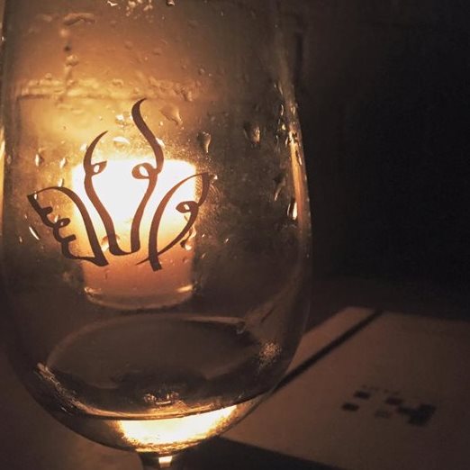
That’s not to say that Herbert doesn’t see the value in restaurants having a strong logo. Quite the opposite, in fact. Herbert is enamoured with the Bird Cow Fish logo, which she still uses to this day, despite her restaurant closing in 2012.
Logos work well for restaurants, she said, when they say something about the business’ values.
“I think my logo is even more important now that I don’t have the restaurant, and it certainly kept the brand going when I was working at Carriageworks Markets. Now I don’t have those markets, but I’ve still got the logo on my email and those sorts of things. I’m working on a project now and if I’m emailing a bunch of people, they might not remember who Alex Herbert is, but as soon as they see Bird Cow Fish they know about the restaurant.
“It’s about keeping the brand alive. After I left the restaurant, I kept the market going because it was a job, but because I wanted to keep the brand going too. Having only just given up the markets in the past six weeks or so, I now know that the Bird Cow Fish brand is an established brand. I don’t necessarily need to have a restaurant or be running a caf. It’s connected to values and a style of food and beliefs around food that now have outlived any restaurant that I might be practicing out of,” she said.
What makes a good logo?
One Design Office (ODO) was charged with the task of designing a brand for Seagrass Hospitality’s Hunter & Barrel concept, which so far has two sites: one in Sydney and another in Melbourne.
“I remember the CEO calling us and he said ‘I want to create a new brand that sells meat and beer, but I also like Game of Thrones.’ So it was really a task for us to make the brand a bit more abstract and not shout out Game of Thrones or pick something from medieval times, but to really try and bring in elements that are contemporary,” said Samson Tiew, director and registered architect at ODO.
The result is a stag head and shield, created out of geometric lines. The logo not only ties in with the design of the venues, but can also be seen on the restaurant’s website and social media channels, as well as on staff uniforms.

“We find that a logo is integral to rolling out a well designed restaurant. When we look at logo design, it’s not just the brand that we’re looking to represent, but we’re thinking about how we can use the logo in the space itself – how can it become a light fitting, or an emblem in the floor mat? It’s about tapping into brand presence. And more often than not, if you have an emblem or logo that people can relate to, it’s a lot more punchy than a name, which can be hard to remember,” he said.
An effective restaurant logo can not only be replicated across different mediums, it should also align with what the customer will experience in the venue.
“If you look at the food offering at Hunter & Barrel, they still employ a lot of traditional cooking methods, like they use a charcoal pit to cook the meat and they serve it on a chopping board. But at the same time it’s very contemporary in character … and if you look at the logo, it’s a simple logo but it’s also sophisticated; it’s got taste and character. We wanted both [the logo and the offering] to convey the same vision and character.”
 Hunter & Barrel
A logo needs to be quick and easy to read if text is used, Herbert (pictured below) adds. She agrees with Tiew that the branding should also communicate an element of the business’ concept or offering to the customer. But at the end of the day, subtlety is key.
“I think that when a logo is engaged with with emotion and thought, as I think my logo is … and if it’s done well then it has the capacity to subconsciously communicate with other people. It’s a carrier,” she said.
“I can’t tell you how many people, after all these years, have suddenly gone ‘oh God, I can see it now. It’s a bird, a cow and a fish.’ Eventually it becomes a design that has meaning. A lot of people didn’t connect that it was a bird, a cow and a fish, and I kind of like the subtlety of that.”
DesignCrowd’s Jo Sabin recommends restaurateurs and foodservice operators have a clear understanding of what their business is offering and what it stands for before approaching a designer or marketing service.
“You can say to designers ‘I like these logos or I don’t like these logos from within the industry’. That helps to clarify what sort of design elements you like or don’t like,” she said. “You need to be clear about your goals and what you want the design to be. Try and be clear that you want something unique.”
Sabin, like Herbert and Tiew, insists that logos need to be adaptable so that they work on different platforms, whether it be on a menu, a business card, a website, Instagram, on a poster or on uniforms. But the most important thing for operators to do – before they sign off on their new logo – is ensure that their business is up-to-scratch.
“Don’t forget: a logo is a very important element. It says that you’re professional and aspirational, but you also – as a business – have to put in the work to ensure the logo has a solid foundation. You need a good business plan and a good logo. Then the assets all come together and you’re on your way.”